:
:
:
:

Mome Love Social Media Rebrand
MomeLove Social Media
2025-2026
about.
SCAD MOMELove rebrand
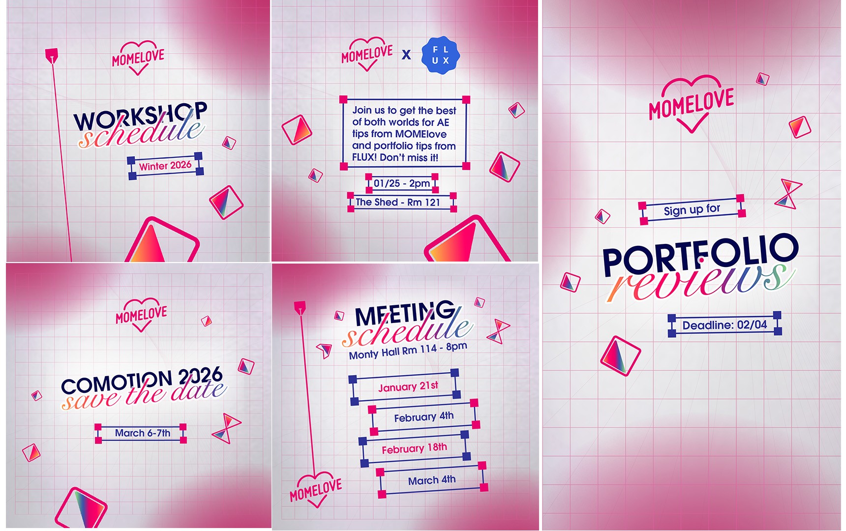
You can check the rebrand live on instagram August 2025, will keep posting through out the year.
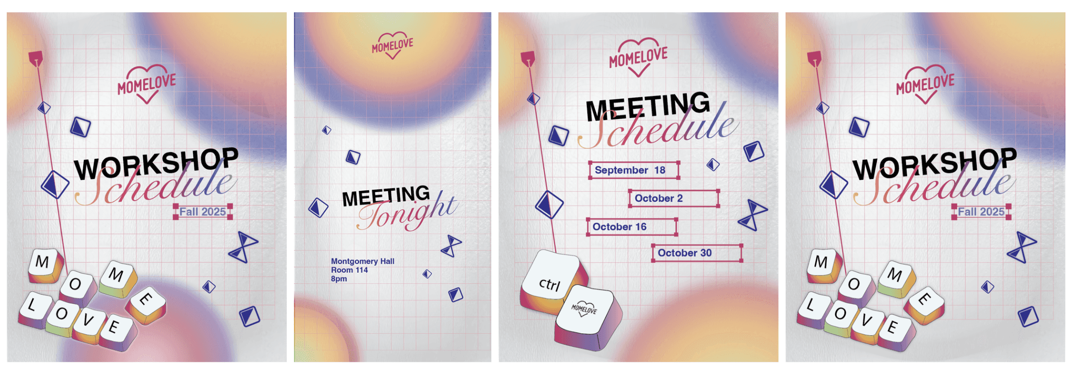
The SCAD Motion Media Club needed its annual social media rebrand, and my concept was selected. I art directed, designed and animated this project. Its purpose is to create a stronger sense of community by referencing the tools and iconography found in familiar interfaces for motion designers, while giving them a unique stylization that maintains Momelove’s brand equity and brings a refreshed art direction for the upcoming year.


These designs went through several iterations until they fully met the objectives of the new rebrand brief while remaining aligned with the club’s core pillars. After several months of work, the rebrand is now ready for use. Here you will find the full process as well as the final deliverables—including style guides, animations, and templates—that will be implemented throughout 2025–2026.
Stage 1: Research for Concepting, Direction:
After researching the previous branding for Momelove’s social media, we identified key insights that guided the new direction. Our target audience was people familiar with motion graphics, so incorporating clear and recognizable references was essential to foster the sense of belonging and community that creatives in this field value.
Because these posts would be seen by both students and alumni, we aimed to capture their attention with designs that reflected current motion design trends—such as gradients, stylized illustrations, playful typography, and subtle abstraction. At first, we explored a style with darker backgrounds, gradients, and thin line work. While visually appealing and on-trend, this approach ultimately did not align closely enough with MomeLove’s established branding, so we decided to shift our direction.
This new approach was much brighter and aligned more closely with the existing color palette. The art direction emphasized vibrant gradients, lighter backgrounds, and assets that were less abstract. The treatment of typography was more meticulous, placing greater focus on clarity and readability, which was essential since these posts were meant to inform the club’s community about upcoming events.
Stage 2: Preliminary Design:
I began by creating vector illustrations of keyboards using a preliminary color palette and testing different layouts. While we decided to keep the keyboard illustrations, some of the other compositional elements were either too abstract or not adding value. The background also failed to draw enough attention, and the overall design lacked cohesion. We then moved into new iterations that helped bring all the elements together more effectively.
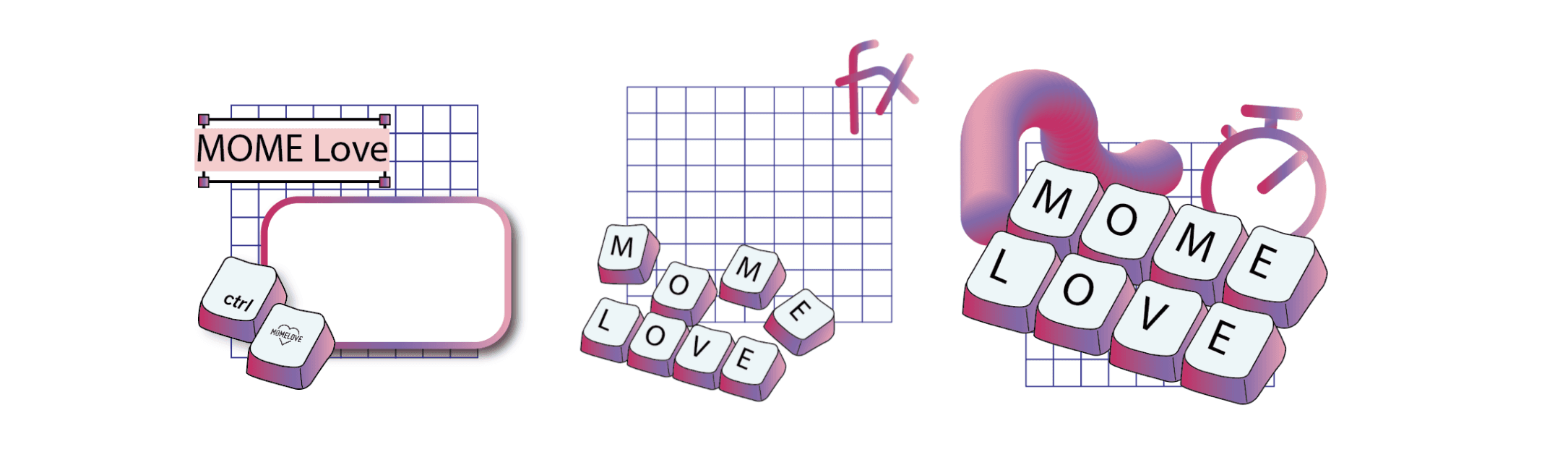
I decided to focus on giving more visual weight to the information in the designs. I experimented with different font combinations and treatments until I achieved a contrasting result that naturally guided the eye to the key details. I also introduced a grid background with subtle gradient shapes, then tested various text box styles and color variations to create a cohesive connection between the vector illustrations and the rest of the design. Although this iteration was closer to what we envisioned, it still didn’t fully align with the brand’s color palette, which led me to develop one final version.
Stage 3: Finalize refinement, Prepare style guide:
At this stage I had approval and my design had been voted to be the new branding. The last changes I made to the design helped it to align perfectly with both brand equity and the refreshed look we were looking for. By making the color pink protagonist and keeping a narrow color palette, I was able to sucssefully align the concept. Each design feels unto date while using classic fonts like Helvetica, to make sure things are clear and legible. The after effects interface is being reflected on the elements in the design, and even clever copy-write like cents MomeLove, helps enhance the connection to those who are a part of this industry.