Client
Take 5 Car Wash
YEAR:
2025
Ad Campaign and Rebrand

Experience The Clean
Art Direction
Designer
about.
For SCADpro, Take 5 car wash, the 2nd largest in the united states came with a brief that aimed increase sales but also create a social media campaign that will be both relatable but also change how their brand was perceived by their clients. The goal was to provide them with a refreshed unique voice in an industry where visual language and tone are one of the few things that can be a differentiator factor.
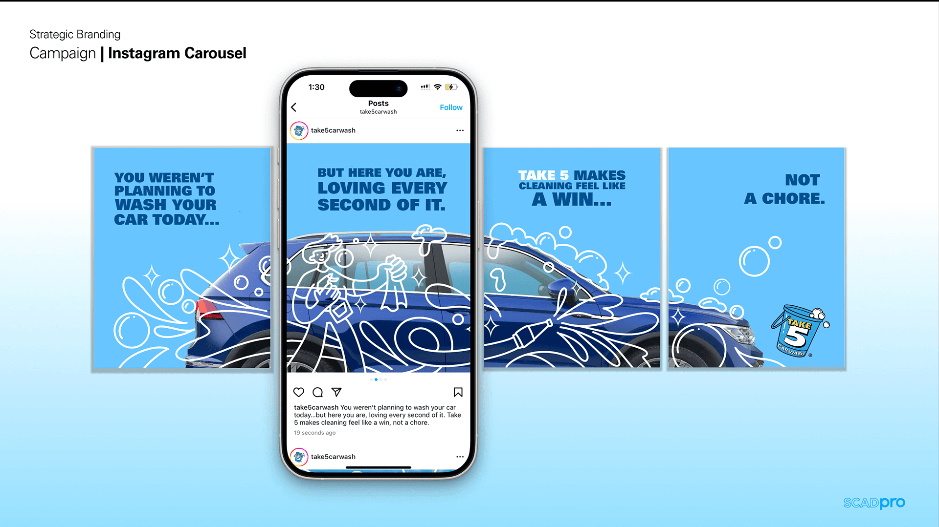
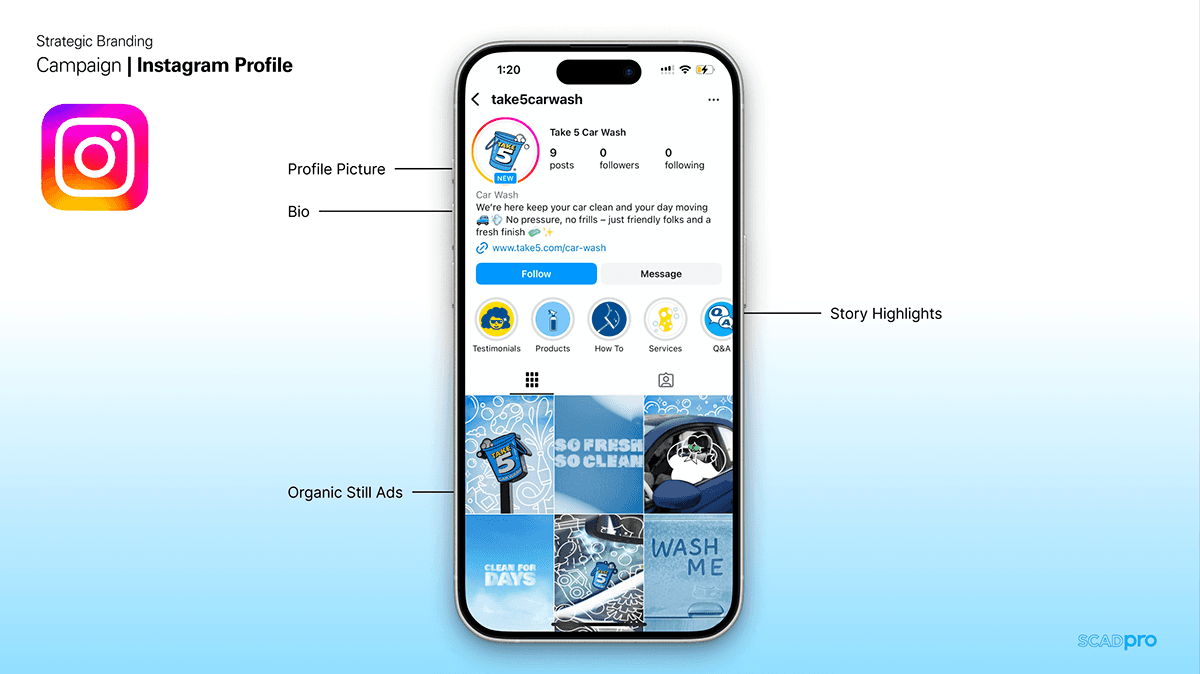
By the end of the project the Experience the clean campaign was launched. Take a look at some of the social media visuals here. https://www.instagram.com/take5cw/.


Campaign.
Stage 1: Research and Alignment: My role as an art director and designer for this project required me to team up with both strategy and design team in order to apply the key insights for the camping into the direction. We started by familiarizing ourselves as much as possible with who was Take 5. We spend several weeks researching about the brands voice, Audience segments, behaviors, mapping brand positioning v.s competitors and developing personas.
The strategy team developed three Personas and segmentations. Time pressed consumers, Convenience focused care givers, Gen Z urbanities and Budget Conscious consumers. With this insights and focusing on pain points the creative director developed new content pillars for the campaign. Friendly, Humorous, Trustworthy and Fresh.
From this point, I started developing the what. Basing myself on this key insights I was able to polish and refine the several options I had for the campaigns visual direction.
Stage 2: Developing a clear direction:
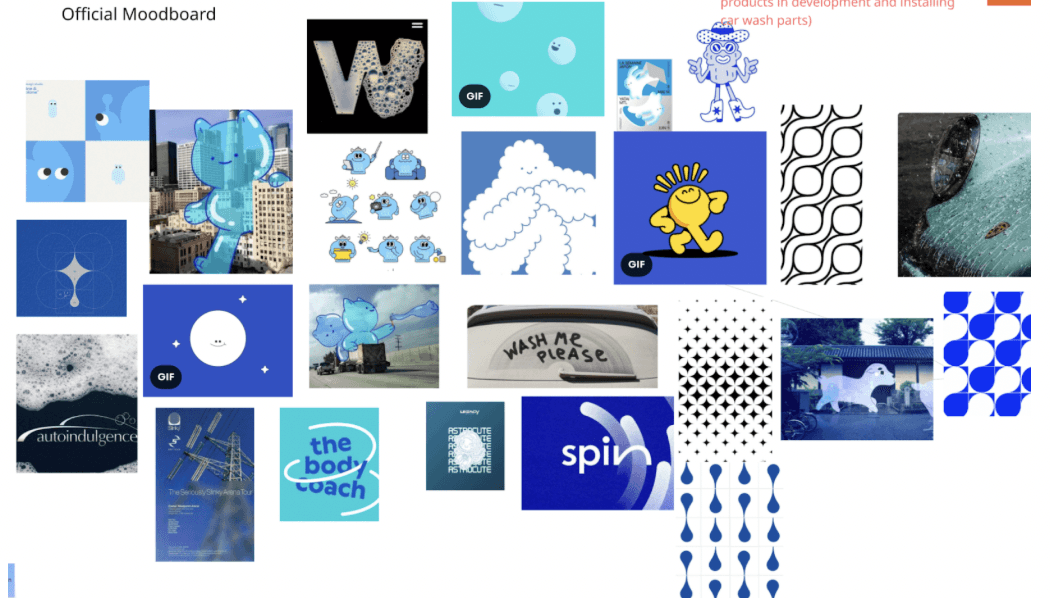
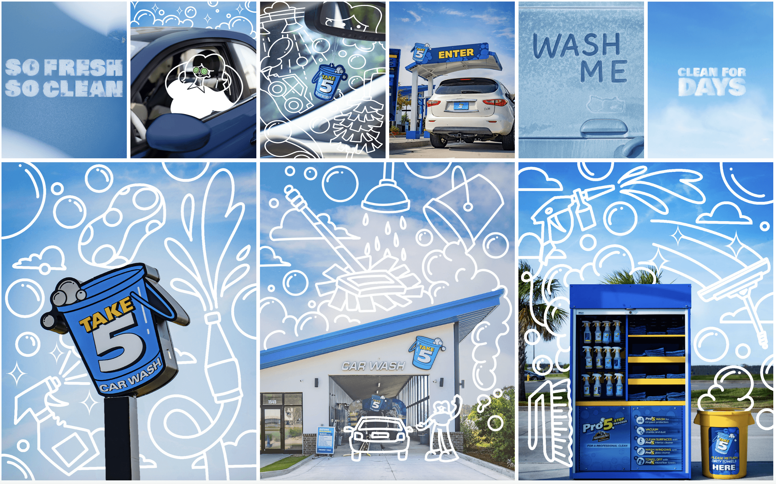
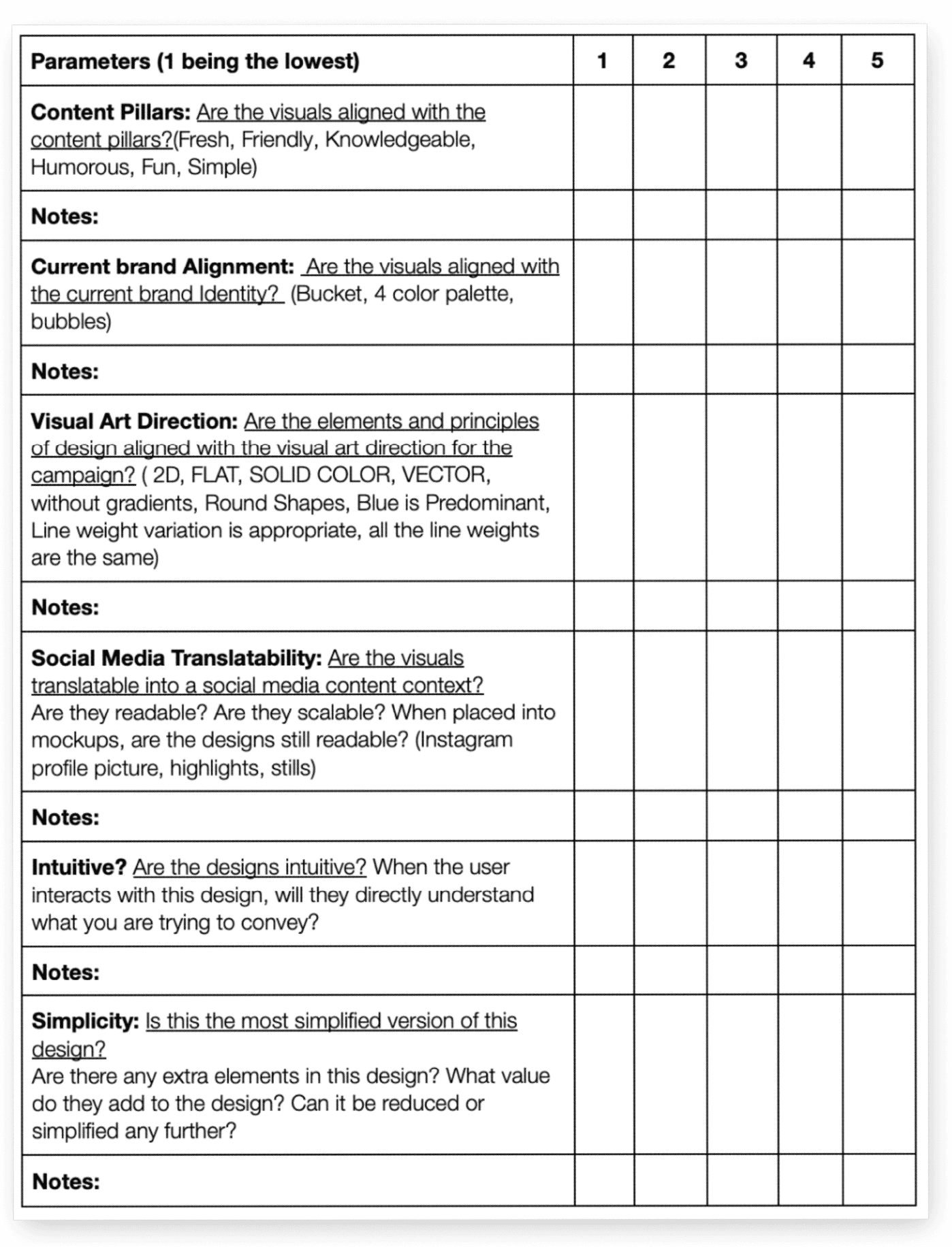
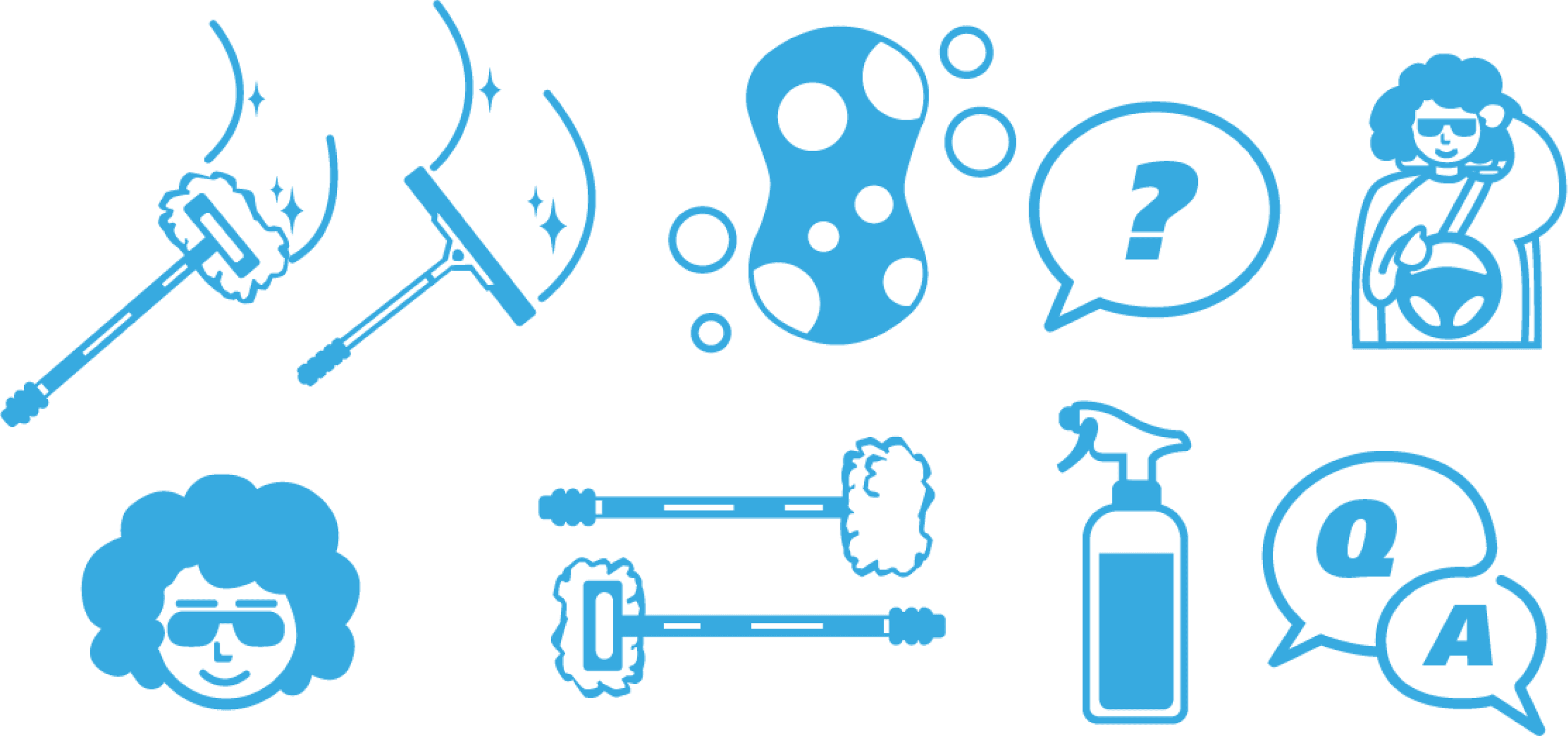
The art direction focused on the sensorial experience of clean. How does cleaning feel, soap texture, feeling refreshed, taking in account the convenience factor but also making the visuals fun and distinctive. I developed a scorecard to help the design team and myself, stay on track with the art direction decisions we had taken. This helped us along the way to create reiterations of the designs utilize they were fully aligned with the scorecard. This helped us to stay on track but most importantly to be objective with comments weather they were from other people in the team or the client feedback. The scorecard was very helpful in early stages, so the client had an idea on what to expect before the design stage begun.
With the direction refined and approved by the rest of the creative team, we were ready to start working.
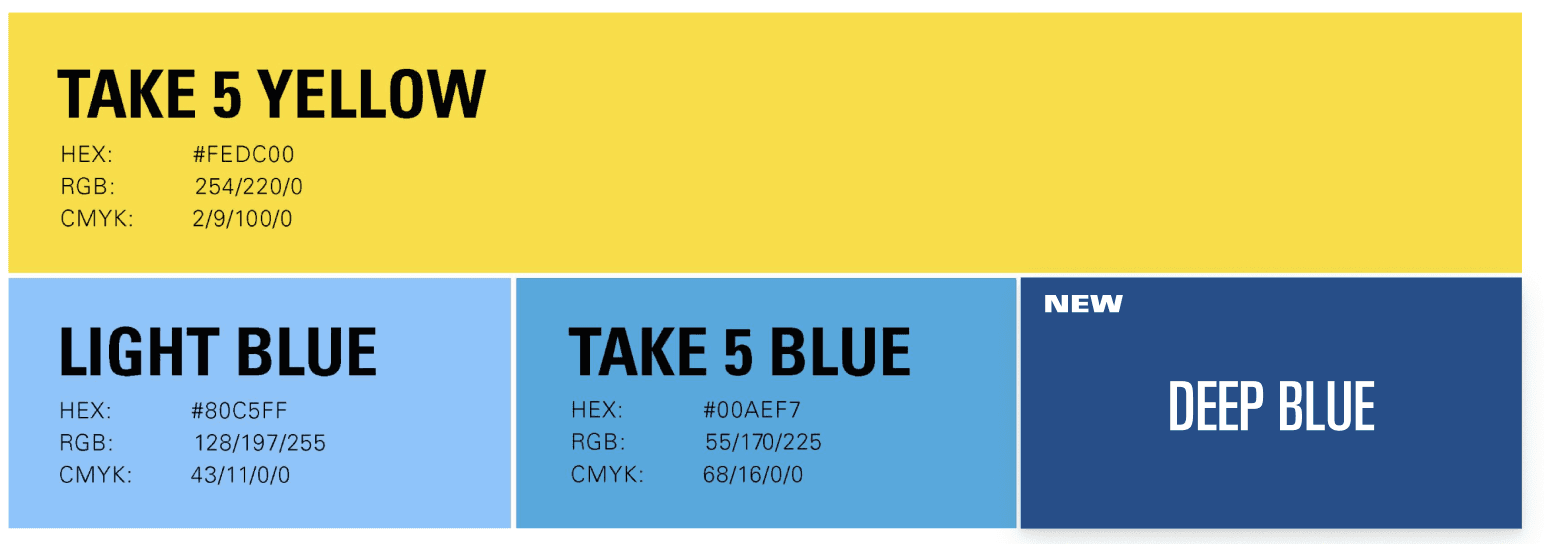
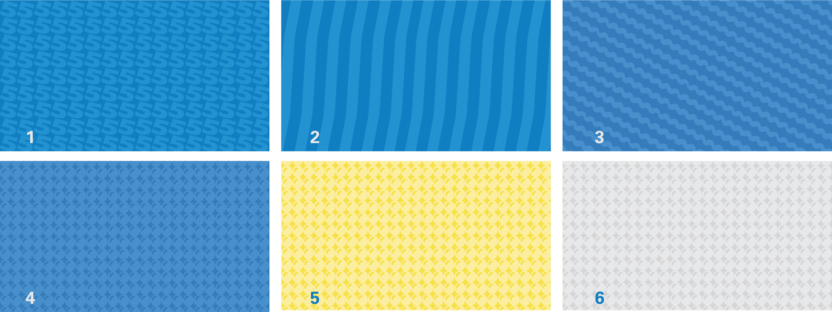
Stage 3: Design Style guide: We were asked for a new style guide with both new content pillars and brand tone of voice which was developed by the creative director along side with the copywriter and also a new visual approach.
 |  |  |
 |  |
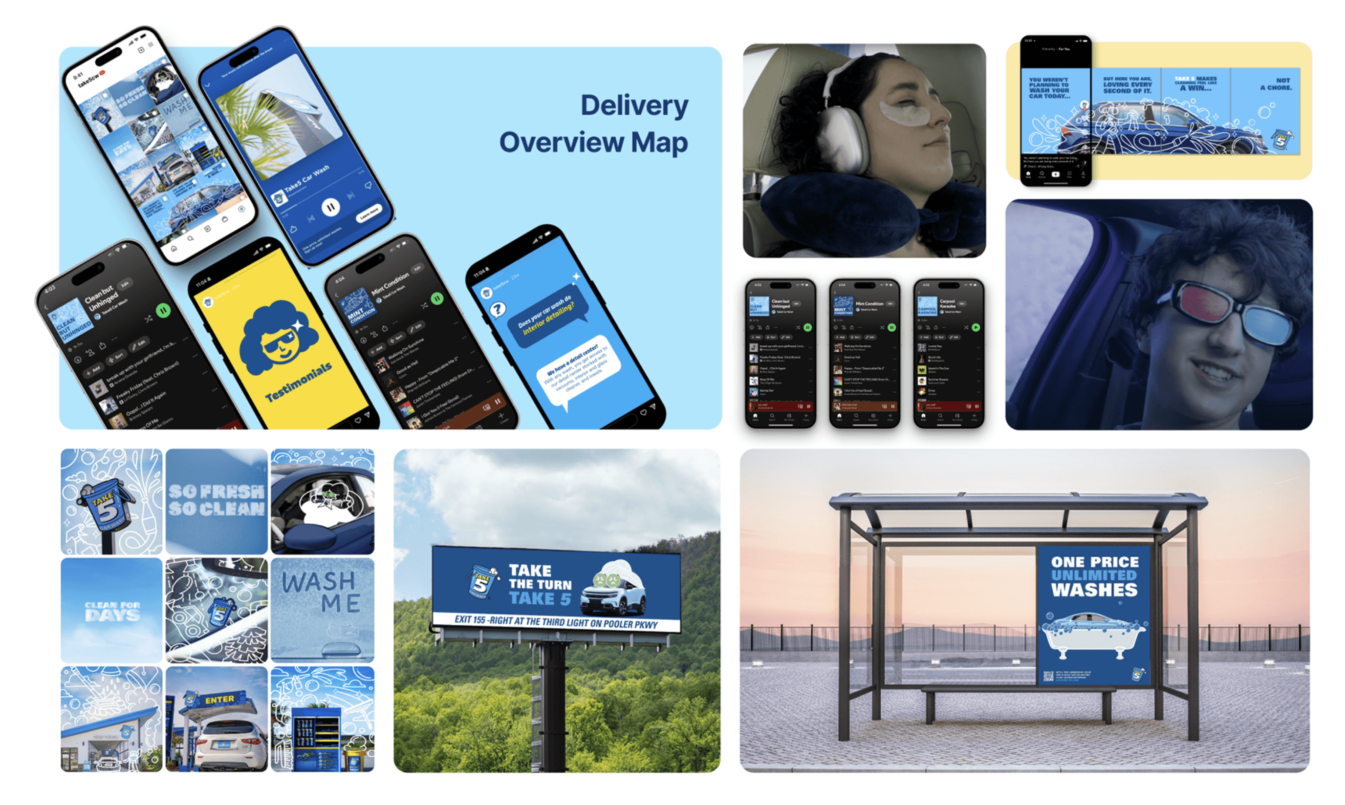
Stage 5: OHH Assets Development:
For this stage I was asked to design the billboards and I had help from one of the designers with the illustrations. We wanted the Visual parts of it to grab the attention from the audience by making unusual visuals like a car taking a bath or at the spa. That is why we had to maintain the text as simple and straight forward as possible. They wanted the logo as big as possible in there.